Add or edit Fields
Fields are the lowest level in the User Interface Editor hierarchical structure. This is where users will contribute to data within the database. Fields can only be added to an element, not directly to a group or tab.
When adding a field, admins can choose from 8 field types. See Field Types below. The field types have some common characteristics and some are unique special conditions.
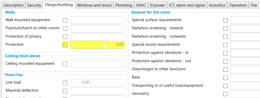
An element with three fields; Yes/No, Text, and Numeric - working together
Create new field
Select the element where the new fields should be added.
Select "New field" in the top menu and choose the desired field type from the drop-down menu, or right-click an element and select “New field → ”
Enter properties. Read more details below.
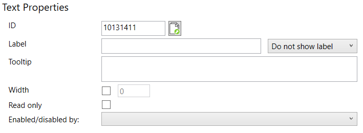
Example of properties for a “Text” field
Field types
Fields may be of different types and also have different properties according to type.
Field type | Explanation |
Multi line text | A text field that covers several lines is designed for fields that potentially will contain paragraphs of text. The size of the area of the box is defined by both height and width 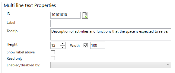 |
Formatted Text | It has the same usage as multi-line text but allows for formatting (e.g., Bold, Italic, colored text, etc. Formatted text fields cannot be used for excel import/export workflows and cannot be added as columns to lists. |
Yes/No | Yes/No field (checkbox). Can be used alone or together with other field types. e.g. as an enabler of other fields.  |
Numeric | Field for numerical values. Define the total number of digits allowed, and number of decimals. Data type must match when syncing with external data sources. 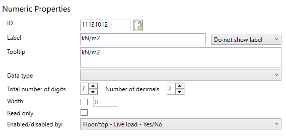 |
Multiple choice | Fields offering users to choose between several predefined options (text). Can be presented as a drop-down menu (combo-box) or radio groups. 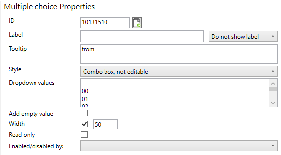 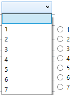 combo box (left) |
Text | One-line text field 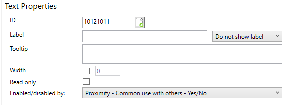 |
Date | Field for setting date. 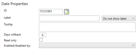 |
Fixed text | Field for fixed text which cannot be edited. Fixed text fields cannot be used for excel import/export workflows and cannot be added as columns to lists. They only show in the User Interface. 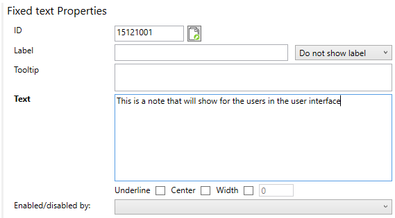 |
Properties
Some properties are common to all field types, and others are specific to certain field types. The last column in the table (Field type) will inform which field type the property is available for:
Property | Explanation | Field type |
ID | Database unique ID for the field | All |
Label | Optional label to be placed either before or after the field. Use the associated dropdown to define where to show the label. | All |
Tooltip | Help text that will appear as users hover over the field in the user interface | All |
Enabled/Disabled by | If you want the selected field to be enabled/activated by a Yes/No field. Use the associated dropdown list to select a yes/no field available within the tab. A field can not be enabled by a Yes/No field placed in another tab. | All |
Read-only | Set to read-only to lock values. Setting this option will not prevent changes from all sources. The field is still editable via Excel, Revit/Archicad. | All, except Fixed text |
Height | Option to overwrite default height. By default, the field will span to use available space. It’s recommended to use default behavior, but overwrite if you have special needs. Insert height in rows vertically. | Multi line text, Formatted text |
Width | Option to overwrite the default with of the field. By default, the field will span to use available space. It’s recommended to use default behavior, but overwrite if you have special needs. Insert width in pixels horizontally. | Text, Multi line text, Formatted text, Numeric, Multiple choice, Fixed text |
Text | Only available for Fixed text. This property contain the text value you want to show in the user interface. | Fixed text |
Underline & Center | Only available for Fixed text. Controls underline of the text value and if text value should be center aligned or not. Default behavior is left aligned | Fixed text |
Show label above | This option will place the element label, if used, above Formatted text or Multi line text fields. Making the field use more available space in the user interface and in PDF reports | Multi line text. Formatted text |
Data type | Option to specify data type for numeric fields. If left blank the field will have default data type which is whole numbers | Numeric |
Total number of digits | Define how many digits should be allowed in the numeric field. If left blank the default value of 7 will be used. | Numeric |
Number of decimals | Define how many of the allowed digits to be decimals. If left blank the default value of 2 will be used. | Numeric |
Style | Specifies the appearance of Multiple choice fields
| Multiple choice |
Dropdown values | In Multiple choice fields, each value represent an option in the multiple choice list. If you wish to add a blank option, make sure to select “Add empty value” (see below). The dropdown values will be sorted by their input position. | Multiple choice |
Add empty value | In Multiple choice fields, this option will add an empty value so users can clear the field if needed. | Multiple choice |
Days rollback | Define how many days to roll back as default. If left blank the current date will be set as default. |
Copy fields
Select field
Right-click
Select “Copy”
Select the element to paste into
Right click element and select “Paste”
Fields can also be copied when elements, groups or tabs, containing fields, are copied.
Delete fields
Select one or more fields and delete using the “Delete” option in the top menu or Right click → Delete.
Fields will also be deleted when elements, groups or tabs, containing fields, are deleted.
When deleting tabs, groups, elements, or fields in a project where the field is in use with data, users in the user interface editor will get this warning message:
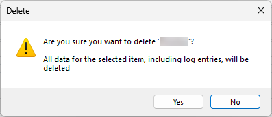
Warning when deleting fields
This warning message ensures that the user interface editor is aware that the changes they make will delete data from the project.
.png)